
Data Table Pro: building for dense product interfaces
A project story about designing a typed, virtualized React data workspace for demanding application workflows.
- React
- TypeScript
- data grids
- product design
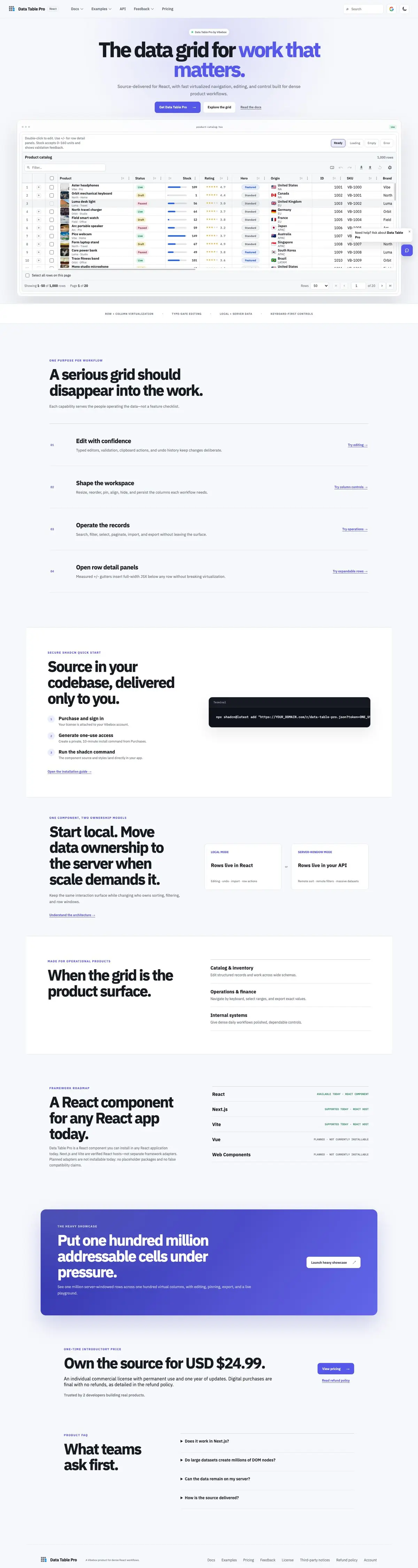

Hover the browser to scroll the live page capture.
- Project
- Data Table Pro
- Type
- Product
- Status
- Live
- Sector
- Developer tools
- What we built
- Virtualization stress-tested with a one-million-row example
- Editing, pinning, import, export, and keyboard navigation
- Docs, pricing, checkout, and source-delivery workflows
- Live site
- rdt-pro.vibeboxph.com
Data-heavy product screens have a particular kind of difficulty. The interface must hold a great deal of information without making ordinary work feel slow, fragile, or visually exhausting. Data Table Pro began with that problem.
The project is a typed, virtualized React data grid for dense product workflows — source-delivered into the customer's codebase, not locked behind a hosted-only runtime. Around the component sits a full product surface: documentation, examples, pricing, checkout, account purchases, and a one-use install path. The grid itself supports the interactions operators expect: editing with validation, search and filters, pinning, import and export, and keyboard-first navigation.
The product problem
Many tables work well in a small demo and become frustrating as the dataset and interaction model grow. A serious data surface needs to handle several concerns at the same time:
- large datasets without rendering every row at once;
- clear selection, editing, and keyboard behavior;
- pinned information that remains useful while navigating;
- import and export paths that match operational work;
- predictable TypeScript contracts for the team integrating it.
The design challenge was not to make a table look decorative. It was to make a dense interface feel controlled.
Designing under pressure
The live product includes a heavy showcase configured around one million server-windowed rows across one hundred virtual columns — one hundred million addressable cells. That does not mean every customer needs that volume on screen. It is a forcing function: the architecture must remain intentional when the easy path — rendering everything — is no longer available.
Row and column virtualization keep the visible work bounded. The interface then has to preserve the user's sense of position, state, and cause and effect while cells enter and leave the rendered window. Performance and interaction design become the same problem.
What virtualization forces you to decide early
Once rows and columns are no longer all present in the DOM, several product details become architectural decisions:
- how selection and focus behave when rows leave the rendered window;
- how sticky headers and pinned columns stay aligned while scrolling;
- how search, sort, and filter results communicate that the full dataset has changed;
- how keyboard navigation stays predictable for operators who work quickly.
These are not polish items. They are the difference between a demo grid and a tool people can trust for daily work.
Interaction design for operators
Dense interfaces are used by people who repeat the same actions for hours. That changes the design brief:
- editing should feel immediate and reversible, with typed editors, validation, clipboard actions, and undo;
- column controls should let teams resize, reorder, pin, align, hide, and persist the workspace each workflow needs;
- search, filter, select, paginate, import, and export should happen without leaving the surface;
- empty, loading, and error states should explain what happened next.
A marketing screenshot can hide all of that. A working product cannot.
Local mode and server-window mode
One of the stronger product bets is keeping a single interaction surface while changing who owns the data.
In local mode, rows live in React — useful for editing, undo, import, and row actions during evaluation or smaller datasets. In server-window mode, rows live in the application's API: remote sort, remote filters, and massive datasets without pretending the browser holds every record.
That split matters because teams often start local and only later need server ownership. The grid should not force a redesign when that transition arrives.
A product, not only a component
Source delivery is part of the interface. After purchase, the license attaches to a Vibebox account. The buyer generates a private, short-lived install command and adds the component through the shadcn CLI. The source and styles land directly in their app — owned code, not a black-box dependency they cannot inspect.
Documentation and examples explain evaluation. Pricing and checkout establish a commercial path. Account and purchase areas support handover. That broader workflow matters because even a strong component is difficult to adopt when evaluation and delivery are unclear.
The visual identity follows the same principle. The grid mark is compact and utilitarian, while the offset blue cells express virtualization without needing an elaborate illustration.
Why the website matters as much as the table
Teams evaluating a data workspace usually ask the same practical questions:
- Can we understand the API and TypeScript contracts quickly?
- Can we see demanding examples before committing?
- How do purchase, access, and source delivery work?
If those answers live in a Slack thread or a half-finished README, adoption stalls even when the component is strong. The public site is part of the product surface.
Stack and roadmap honesty
Data Table Pro is a React component today. Next.js and Vite are verified React hosts — not separate framework adapters. Vue and Web Components are planned and not installable yet. That honesty is deliberate: no placeholder packages and no false compatibility claims.
The important architectural bet is not a particular library name. It is keeping rendering cost proportional to what the user can see, while keeping the interaction model coherent for the full dataset — whether rows live in React or on the server.
What the work reinforced
Three lessons from the project apply to other complex interfaces:
- Build around the demanding workflow. Dense tools should be shaped around repeated operator actions, not a marketing screenshot.
- Use scale as a design constraint early. Stress examples reveal assumptions before they harden into the product.
- Treat adoption as part of the interface. Documentation, examples, purchase, and source delivery are part of the customer experience.
Continuing work
Data Table Pro is continuing work, not a fictional client launch. The public story will be updated as the product and its documentation evolve. If you are building a dense operational interface of your own, the useful takeaway is simple: design for the hardest honest workflow first, then let the marketing page explain what already works.
Keep reading
A project story about Barty Bakes, a bakery website in preview with a 3D build-a-box, GCash payments checked by a person, and pickup or delivery, ahead of online ordering opening.
Project story · 3 min readDayo: a social map where every review is a real visitA project story about Dayo, a living social map of places in the Philippines, shown as a playground on synthetic seed data, where every review is tied to a GPS-verified visit.
Start a project
Planning a website of your own?
Plan it in Launchpad: answer plain questions, watch a live preview take shape, and see the price before you pay anything.